Ichimoku Cloud Explained: A Comprehensive Guide to Trend and Momentum

[ez-toc] Introduction In the world of technical analysis, few indicators offer as much versatility and depth as the Ichimoku Cloud. Originally developed by Japanese journalist Goichi Hosoda in the late 1930s, the Ichimoku Kinko Hyo—meaning “one glance equilibrium chart”—provides traders with a complete view of market conditions at a single glance. This powerful tool helps […]
How to Trade the Cup and Handle Pattern: Spotting Bullish Continuations

[ez-toc] Introduction to the Cup and Handle Pattern Technical analysis offers traders a variety of chart patterns that provide insights into potential future price movements. One of the most reliable and well-known bullish continuation patterns is the “Cup and Handle” formation. This pattern, popularized by William O’Neil, signals a consolidation phase followed by a breakout, […]
Identifying and Trading the Inverse Head and Shoulders Pattern
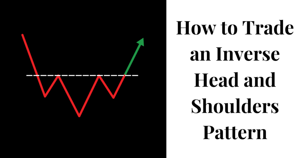
[ez-toc] The inverse head and shoulders pattern is among the most reliable trading patterns you should know for spotting potential market reversals. Unlike bearish formations such as the bear flag pattern or bear pennant pattern, this pattern signals a possible upward price movement after a downtrend. Professional traders and technical analysts value this pattern for […]
Megaphone Pattern Trading: How to Identify and Capitalize on Market Volatility
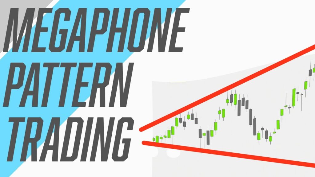
[ez-toc] The megaphone pattern represents a distinctive price formation that traders monitor to identify increasing market volatility. This technical pattern, characterized by higher highs and lower lows, creates a widening price structure that resembles a megaphone or broadening formation. By understanding how to identify and trade this pattern effectively, you can potentially capitalize on market […]
Falling Wedge Pattern Explained: Signals and Strategies to Trading

[ez-toc] The falling wedge pattern is a powerful tool for traders looking to spot potential market reversals. This pattern shows up when prices form a narrowing channel that slopes downward. Learning to spot and trade this pattern can help you find good entry points and potentially profitable trades. What Is a Falling Wedge Pattern? A […]