MACD Indicator: How To Use Moving Average Convergence Divergence in Trading

[ez-toc] The Moving Average Convergence Divergence (MACD) indicator is one of the most widely used technical analysis tools available to traders. This momentum oscillator tracks the relationship between two moving averages of a security’s price, helping you identify potential trend changes and momentum shifts. Understanding how to interpret and apply MACD signals effectively can significantly […]
Fibonacci Retracement: How To Use It for Support, Resistance, and Trade Entries
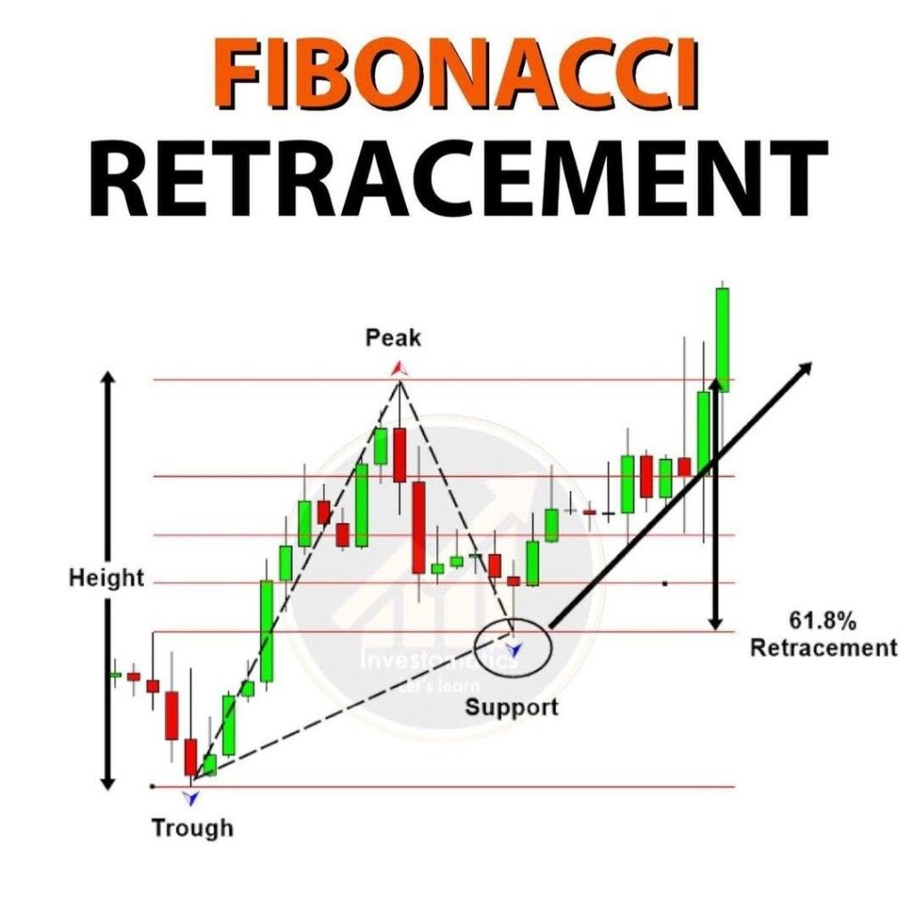
[ez-toc] Knowing how to identify key price levels is critical in any successful trading methodology. Among the most relied-upon tools for this purpose is the Fibonacci retracement—a technical indicator that helps traders locate potential reversal levels in financial markets. Whether an investor is new to the concept or refining their current strategy, mastering Fibonacci retracement […]
Bollinger Bands: How to Trade Volatility and Spot Breakout Opportunities

[ez-toc] Bollinger Bands represent one of the most versatile tools in technical analysis, providing traders with important information about price volatility and potential market reversals. Developed by John Bollinger in the 1980s, this technical indicator has gained widespread adoption across various financial markets. Unlike fixed percentage bands, Bollinger Bands adapt dynamically to market conditions, expanding […]
Rounding Bottom Pattern: How to Trade This Gradual Bullish Reversal
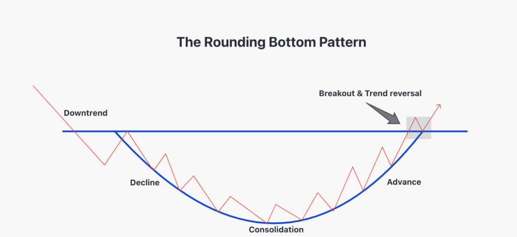
[ez-toc] In trading, the rounding bottom pattern represents a significant bullish reversal formation that develops gradually over extended periods. This pattern manifests as a distinctive “U” shape on price charts, signaling a transition from bearish to bullish market sentiment. For investors and traders analyzing stock charts, identifying this pattern offers valuable opportunities to capitalize on […]
Rectangle Pattern in Trading: How To Identify and Profit from Price Consolidation
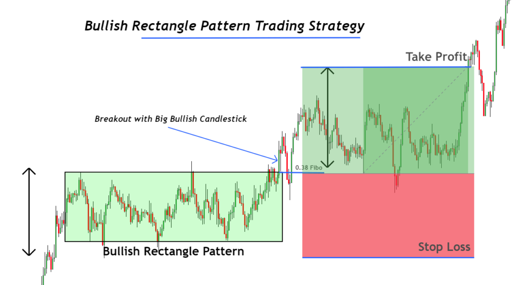
[ez-toc] In technical analysis, price action often moves in identifiable patterns. Among the most common and reliable is the rectangle pattern — a formation that reflects a period of consolidation before the price breaks out in one direction. For traders aiming to make strategic, emotion-free investment decisions, recognizing this setup can lead to consistent returns, […]